For this project we had to come up with a concept that we believed put across the message of 'Positive Ireland'. We were to choose something personal to our own experiences and values. I chose to build my campaign on the idea of Irish people being passionate about what they do.
My initial ideas proved too cliche/not shocking enough, so I turned to mixed imagery to put across my message. My final ideas show various sportsmen wearing unexpected items of clothing; ie. a rugby player in an irish dancing shoe and an irisih dancer wearing stud boots.
My other ideas showed a golfer using a fishing rod, a hurler holding a gold club and a basketball player shooting a shuttle cock.
My original tagline was 'What's your passion?' to get across my idea of people getting passionate about something and trying something new. However, today I changed it to 'Ireland: Unexpected Passion', to link in with the 'unexpected' scene on the billboard.
We also had to design a t-shirt and a promotional item. For the t-shirt I have an irish dancers legs on the front and a rugby players legs on the back. The freebie will be a headband as it can be used whilst playing sport.
Tuesday, May 17, 2011
Wednesday, April 13, 2011
Graphics Ranking
For the passed 3 weeks I have been following a brief to design a book cover for a book. I chose the book 'The Lovely Bones'.
I started by drawing out a mind map and looking at colours, objects and compositions that might suit the book. I then explored further by changing around and mixing themes as well as developing existing ideas.
My 3 final concepts were as follows:


After a class crit, I decided to expand on the ideas put forward in Concept 2. Once I had explored with varying images, typefaces, backgrounds and so on, I re-created the image on photoshop and showed it to the tutors. With a couple of tweaks here and there, this was my final book cover:


Our second brief was to design and make a 'handmade book'.
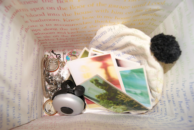
I came up with the idea to look at the den in which Susie was killed. I wanted to twin this concept with the meaning of the snow globe - the penguin is trapped in a perfect world - as Susie was in heaven.
My final idea was to build a wooden box; to represent the den, into which you could look into via a hole cut in the lid. I then put hinges onto the lid so that you could open it easily and view the contents inside. I lined the inside with multi coloured text; to represent the multi-coloured hat Susie was gagged with, and then put in little trinkets that were representative to her. I also used printed text on material to create the hat. See below for images of the final piece.


I started by drawing out a mind map and looking at colours, objects and compositions that might suit the book. I then explored further by changing around and mixing themes as well as developing existing ideas.
My 3 final concepts were as follows:

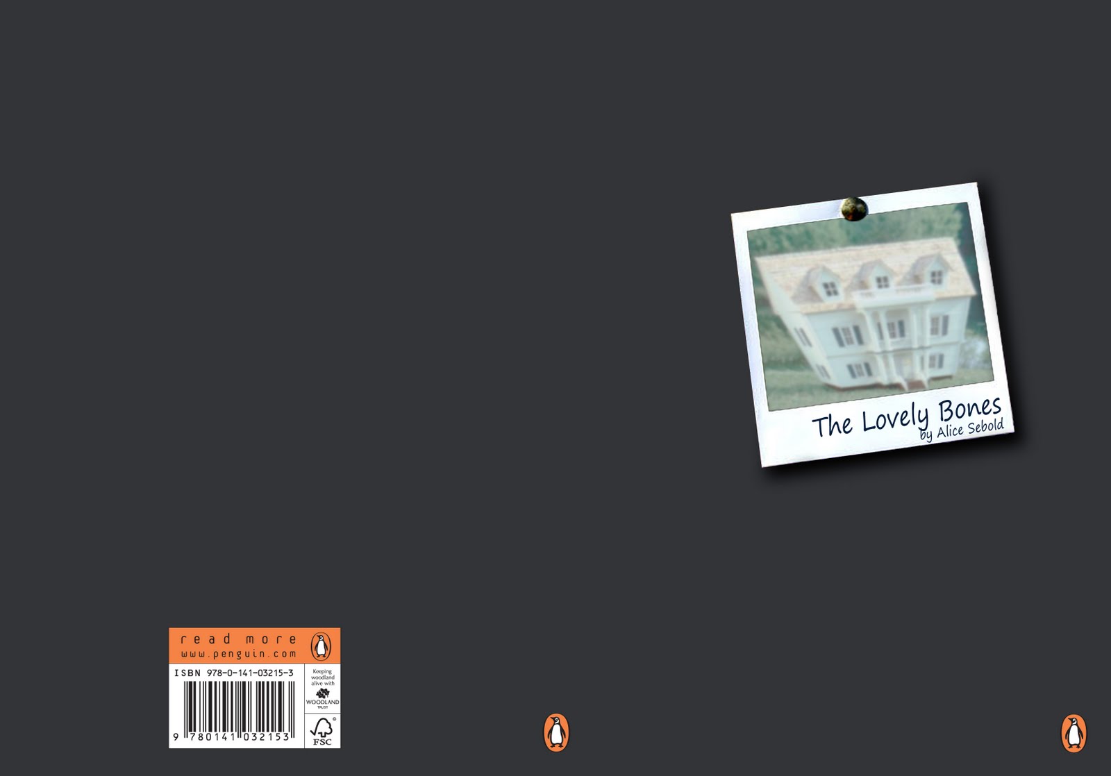

After a class crit, I decided to expand on the ideas put forward in Concept 2. Once I had explored with varying images, typefaces, backgrounds and so on, I re-created the image on photoshop and showed it to the tutors. With a couple of tweaks here and there, this was my final book cover:


Our second brief was to design and make a 'handmade book'.
I came up with the idea to look at the den in which Susie was killed. I wanted to twin this concept with the meaning of the snow globe - the penguin is trapped in a perfect world - as Susie was in heaven.
My final idea was to build a wooden box; to represent the den, into which you could look into via a hole cut in the lid. I then put hinges onto the lid so that you could open it easily and view the contents inside. I lined the inside with multi coloured text; to represent the multi-coloured hat Susie was gagged with, and then put in little trinkets that were representative to her. I also used printed text on material to create the hat. See below for images of the final piece.


Final Space:


Wednesday, March 23, 2011
Vis Comm Ranking Project: Research week
Our brief is to design a book cover for any adult book we chose. The book I have chosen is 'The Lovely Bones' by Alice Sebold. The first week of our project has been allocated to research. At the end of the week we are to give a 10 slide presentation of our research using either Prezi or Powerpoint. I am going to present mine using Prezi. The 10 slides are as follows:
Slide 1: Title and author
Slide 2: Synopsis (150 words) and 3 words to sum up the feeling of the book
Slide 3: Location
Slide 4: When
Slide 5: Main Characters
Slide 6: Theme
Slide 7: Theme
Slide 8: Typography
Slide 9: Mood Board
Slide 10: 2 Book Covers that we like
Presentation viewable below:
http://prezi.com/k5ueggedbe1_/the-lovely-bones/
Sculpture Elective
Project: Five Senses
We started by taking the five senses and creating mind maps. From these we made further mind maps, from which we chose a verb to continue using throughout the project.
I chose the verb: 'to struggle'.
I used this as a start to design and cast two hand positions - a strangling pair of hands and one hand being strangled by another. From here I made various casts in different materials, experimenting with texture, shape, form and material.


Print Elective
For this project looking at the space around us, I returned to my photographs of Limerick, from the Urban Environment brief.
I chose a select few photos and used them along side new found images for inspiration and to get a vibe for the work I wanted to create.
I began by looking at composition, colour and texture, then turned to shape later. I played around with layering colours of varying shades to emphasis depth and also touched on positive and negative space in my third and fourth prints.

The main subjects of my pieces were organic; stone and natural materials such as wood. However, I also looked at brickwork; a man-made version of a natural material.


I didn't want my pieces to be neat of specific, I enjoyed the process of creating, experimenting and not knowing what the exact result would be, and I wanted this to show in my work. I think this gives a 'rugged' feel to my prints, which I am happy with.

One Day Project
Friday, January 28, 2011
Visual Communications Elective
The first week of my first elective proved pretty tough going, but i enjoyed it none the less. Our brief was to create a new form of typography to demonstrate the meaning/mood of a given word. My word was 'retiring'.
I initially looked at the idea of retirement, then realised the many other possibilities of the word; such as shy, lonerism, to be worn out. I used all of these ideas in my initial sketches.
I finally settled on three ideas; firstly: a piece which spelt out the word using items of a retired person, secondly: the word made out of play dough with the letters sagging and cracking and a small G 'retiring' behind the N, and lastly: a photoshop piece with 'retiring' written in white on a white back ground and only the shadow visible. The words are barely visible as if shy, on their own, and not wanting to be seen.
See images below of my work station, progress pieces and final pieces.


In the second week of the project we had the same brief but had to use images to portray our given word. I definately found this week harder and struggled to find a coherent conclusion. Given more time I would have liked to have explored my 2 final pieces in 3D. See below for the 2D result:


It was suggested to me after presentation that I used my word; 'retiring', along with these images.
Monday, January 10, 2011
Final Post for Urban Environment Project
Since my last post I was told that my prints resembled camouflage prints. I have therefore taken this angle within my work by looking at animal prints and using camouflage colours within the project. I also continued to study the kegs by way of 3D; wire, cardboard, aluminium, cans etc. My final display is as follows:


Close up of 3D keg studies

3D keg studies within final display

Close up of prints using camouflage colours

Final Display!
Thank you for reading.
Katy
Subscribe to:
Comments (Atom)